Using Storybook
Key Highlights#
Canvas vs Docs#
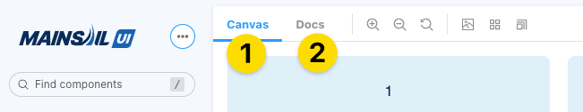
- The Canvas and Docs tabs are your main navigation inside a particular component.
Canvas is useful for testing the workings of the component on the whole. Visual tweaks, viewport behavior, props and actions are all available from this tab.
- Docs should be visited but probably not relied upon for testing the prop usage and controls because it's easier to anchor on a specific story first, then test those props inside the Canvas tab.
Controls vs Actions#
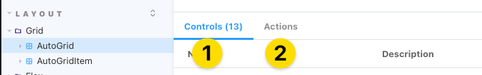
Controls will give you a list of all the props that a component has been defined with (depending on how the story has been set up, it can be controlled with the live example from this panel)
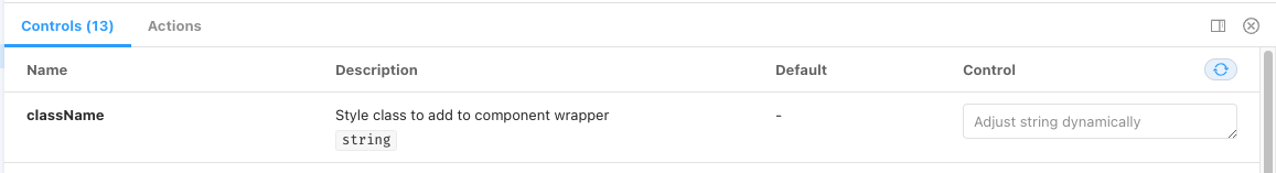
A Note on Controls: Controls can be included or ignored in story setup. They can also be preset with anything defined as a prop value. This means the initial control for a prop may or may not be the actual default value for that prop (which would be defined under the default column)
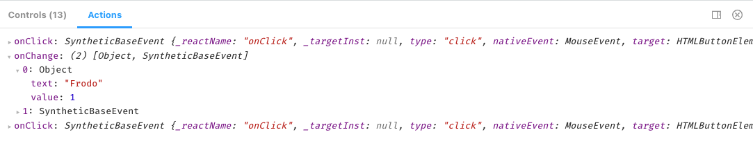
Actions if wired up properly in the story, this tab will give a glimpse into the callbacks and functions that fire when certain actions are acted upon in the component.
ViewPort Testing#
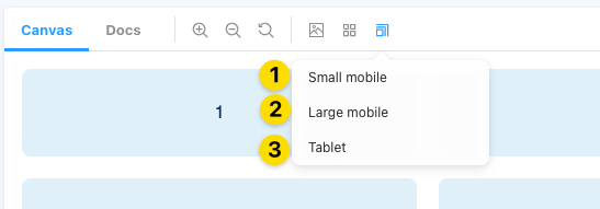
Only available under the Canvas Tab of a story, you can test different viewport responsiveness with this button.
| Size | Breakpoint |
|---|---|
| Small Mobile | sm |
| Large Mobile | sm |
| Tablet | md |
| none | lg |