AutoGrid
Let's take a look at how to use this new layout component to its fullest.
Under the Hood#
<AutoGrid/> uses CSS Grid under the hood. That might sound a little scary. But CSS Grid gives you layout superpowers.
Why use CSS grid over flexbox or other old-school techniques?
Pros:
- CSS Grid allows you more control with less actual markup than any other means of producing responsive layouts
- It provides a great api for producing pain-free gutters and spacing between children
Cons:
- the overall API for CSS Grid is admittedly pretty complicated.
That's where <AutoGrid/> comes in.
It provides an abstraction over the many common use-cases for CSS Grid that you may encounter in frontend development. On top of this, it affords you the ability to sprinkle in responsiveness at the same time with little effort.
Let's take a look.
tip
At any point, feel free to tinker around with the demo on stackblitz
Out of the Box#
Without much customization, AutoGrid will do its best to just arrange things automatically inside the column and row counts you specify. Don't want to specify a row count? That's fine too.
This works great for a uniform system of grid-like items like a layout of cards on screen. But it also can be configured with colSpan and rowSpan on nested items to stretch things across columns and rows. This automatic behavior and the ability to position things at and across any number of columns and rows makes AutoGrid immensely powerful. You're going to have super powers by the time you are done here.
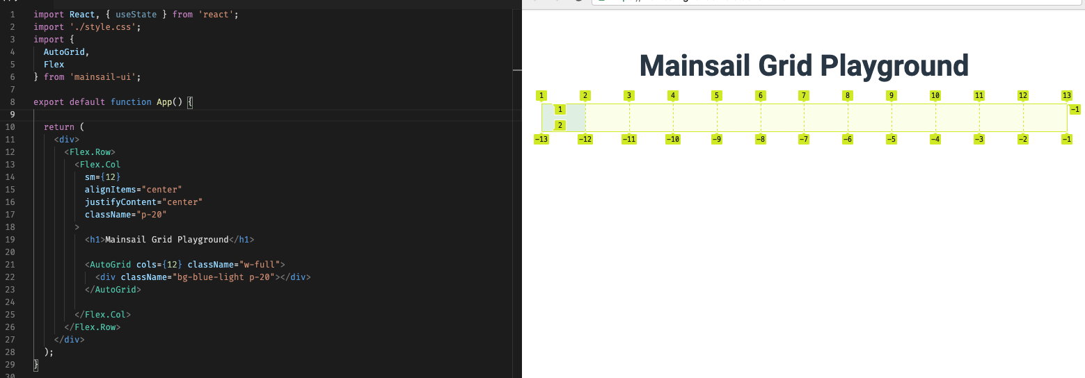
A Dozen Options#
Similar to Bootstrap, our layout components (Flex and AutoGrid) utilize a (max) 12 column scale.
As shown above, this scale provides all the flexibility you should need. The cool thing about AutoGrid, is that you get to specify how many columns you want to use at any time.
For Example
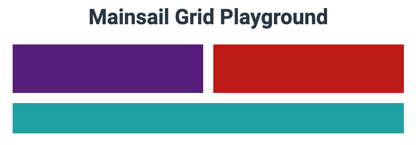
<AutoGrid cols={12} className="w-full"> <div className="bg-blue-light p-20"></div></AutoGrid>Produces this:
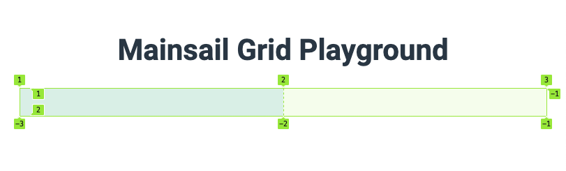
We could have just as easily told it we only want two columns by doing this:
<AutoGrid cols={2} />Which would end up giving us a grid that looked like this:
Where things really get exciting is when you start nesting. But more on that later.
About that Responsive Stuff#
At different breakpoints, you may want different column counts.
You can achieve this by passing in an array of column counts to the cols prop.
This array just represents the [sm, md, lg] breakpoints that the AutoGrid component should adhere to. And you can leave out md, and/or lg if you only want to respond to 1 or 2 breakpoints.
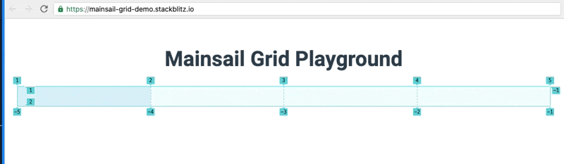
For Example:
<AutoGrid cols={[1, 2, 4]} />// Has 4 cols on large, 2 cols on md, and 1 col on sm breakpointsAnd looks like this:
So why would you ever use a large column count??#
Large column counts come in handy when you want some finer control of things inside the grid. Which means now is a perfect time to talk about nesting AutoGrid components.
Nesting <AutoGrid/>#
Here's an example of a 12 column auto grid parent and a 2 (or 1 at small breakpoint) column child AutoGrid. (The Divs are there for visibility).
Notice when we highlight the child AutoGrid (shown in the coral color), it only tries to take up the width of the first column of the parent grid. Yet, the divs of the child AutoGrid, are now filling in the first (and only) two columns of the nested AutoGrid. Nifty!
<AutoGrid cols={12} className="w-full"> <AutoGrid cols={[1, 2]}> <div className="py-30 w-full bg-violet-middle" /> <div className="py-30 w-full bg-red-middle" /> </AutoGrid></AutoGrid>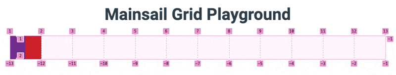
Now, lets introduce some superpowers.
Let's move the child AutoGrid along the horizontal column axis by using colStart... An important distinction is that this prop on the nested AutoGrid applies to the position inside the parent AutoGrid. (It has no effect on its own children divs.)
<AutoGrid cols={12} className="w-full"> <AutoGrid cols={[1, 2]} colStart={4}> <div className="py-30 w-full bg-violet-middle" /> <div className="py-30 w-full bg-red-middle" /> </AutoGrid></AutoGrid>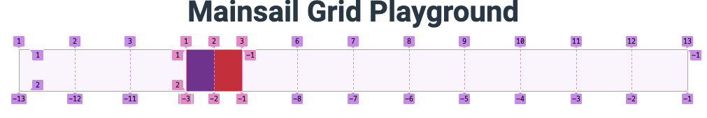
Sweet. We've push over the inner grid to start in column 4! Again, this prop only applies when nested inside another grid.
But what happens if we introduce colEnd?
<AutoGrid cols={12} className="w-full"> <AutoGrid cols={[1, 2]} colStart={4} colEnd={10}> <div className="py-30 w-full bg-violet-middle" /> <div className="py-30 w-full bg-red-middle" /> </AutoGrid></AutoGrid>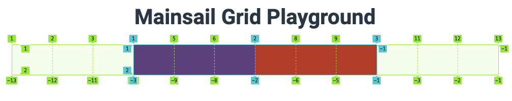
We've stretched the child grid over the columns of the parent grid (starting at 4 and ending at 10)! Awesome.
caution
The colEnd can be a little tricky in that you are not ending the span with the column containing the content, you're ending it before the column number specified.
Using the colSpan prop#
This similar effect can be achieved using the colSpan prop but mixing the two is not supported (at this time). This prop does make it easy to produce multi column spans of children, however, which can be useful in Forms and other grid-centric layouts.
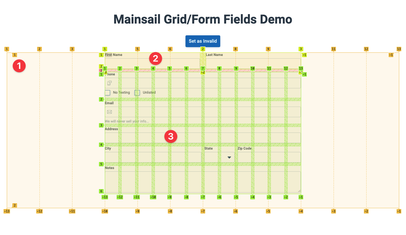
Note: As you will see in the Advanced Grid/Form Demo the colSpan prop can be used directly on the <FormControl/> and supports responsive array column counts.
What about rows?#
AutoGrid will let things flow by "row" out of the box. This means any number of children will flow left to right across the row unless told otherwise by the flow prop.
Let's take a look at this:
<AutoGrid cols={2} gap={20} className="w-full"> <div className="py-30 w-full bg-violet-middle" /> <div className="py-30 w-full bg-red-middle" /> <div className="py-30 w-full bg-green-middle" /></AutoGrid>This grid above is declared with two cols and no rows count, so the children will flow and wrap to the next "available" row by default. As shown below, the green box is the 3rd child and is not going to fit on the 2 column row, so it forms a new one automagically.
With this knowledge, rowSpan vs rowStart and rowEnd achieve similar results to how columns work!
Mind the Gap#
One of the bestest features of the CSS Grid is its ability to produce gutters with hardly any effort or side-effects that plague other layout patterns. (I'm looking at you negative margins and padding.)
AutoGrid comes with two options for producing gutters. gap OR gapCol and gapRow can be used to produce similar effects. The latter two are used instead when you need a different spacing horizontally vs vertically.
Here's the previous example we used. Notice that the <AutoGrid/> has a gap prop applied.
<AutoGrid cols={2} gap={20} className="w-full"> <div className="py-30 w-full bg-violet-middle" /> <div className="py-30 w-full bg-red-middle" /> <div className="py-30 w-full bg-green-middle" /></AutoGrid>Gaps produce the space between children on a pixel scale per the design specs available for our common margins.
| Specifier | Pixels |
|---|---|
| 0 | 0px |
| 4 | 4px |
| 8 | 8px |
| 10 | 10px |
| 12 | 12px |
| 15 | 15px |
| 16 | 16px |
| 20 | 20px |
| 30 | 30px |
| 48 | 48px |
<AutoGridItem />#
One more piece of the puzzle; The AutoGridItem (or <AutoGrid.Item> if you desire to only import one thing) is another available component that can be used inside of AutoGrid that offers you a means of providing the following controls to children without nesting another grid:
| Prop |
|---|
| rowSpan |
| colSpan |
| rowStart |
| rowStart |
| alignItems |
| justifyItems |
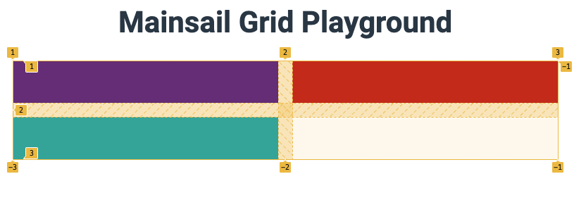
This example illustrates how the AutoGridItem can be used to control spanning:
<AutoGrid cols={2} gap={20} className="w-full"> <div className="py-48 w-full bg-violet-middle" /> <div className="py-30 w-full bg-red-middle" /> <AutoGrid.Item colSpan={2} className="bg-green-middle" /></AutoGrid>To achieve this:
And with some creativity, you can achieve things very easily that would be difficult using other layout patterns.
<AutoGrid cols={12} rows={6} gap={20} className="w-full"> <AutoGrid.Item colStart={4} colEnd={10} className="bg-violet-middle" /> <AutoGrid.Item colSpan={6} rowSpan={2} className="bg-blue-middle" /> <AutoGrid.Item colSpan={6} rowSpan={2} className="bg-green-middle" /></AutoGrid>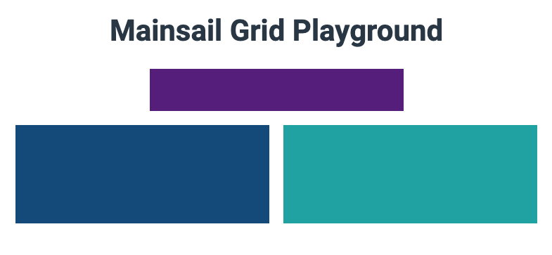
Alignment options#
One key benefit to using the AutoGridItem is the alignment props it affords you for free. Free vertical alignment? What?! Yep.
Notice the emoji below.
<AutoGrid.Item colSpan={6} rowSpan={2} justifyItems="center" alignItems="center" className="bg-green-middle"> 🤯</AutoGrid.Item>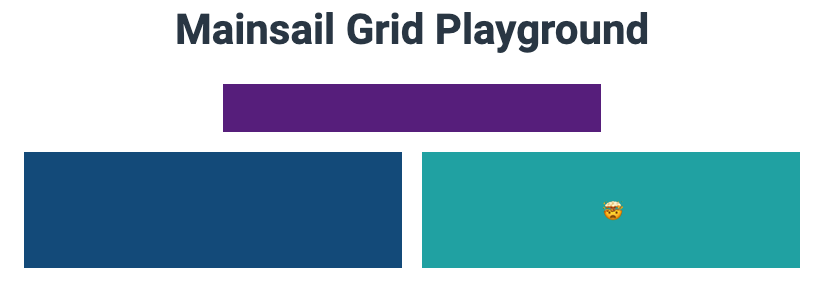
Summary#
AutoGrid is a flexible super tool that gives you the ability to layout simple or complex responsive layouts with relative ease.
Play around in the demo sandbox here.