Forms
Form fields in Mainsail are set up to be as hands-off as possible while still offering some internal help to keep you from having to wire up style markup.
What Mainsail can do for your forms#
- Offers per-spec, pre-styled form inputs and field options (no styling necessary)
- Assists with responsive layout (via AutoGrid)
- Aims to include most accessibility roles and features out of the box (less wiring necessary)
- Offers a clean wrapper
<FormControl/>that will provide disabled/invalid state down to its children (less wiring necessary)
What Mainsail doesn't do for you#
- Maintain form state
- Control validation
The Base Components#
info
For deeper info on each, visit the various stories in Storybook for each Component.
- FormControl - the parent wrapper, provides
isInvalidisDisabled, and more to children automatically; also supports AutoGrid features - Checkbox - an individual checkbox with a text label
- CheckboxGroup - a group of checkboxes (to be used inside a FormControl)
- Dropdown - a multiple choice dropdown
- FormHelpText - the little helpful bits of text that sit neatly under an input
- FormInputIcon - an icon that gets situated inside an
<Input/>field with proper focus/disabled styling applied for you - FormInputOptions - the parent wrapper
- FormLabel - the text that labels a field for visual and accessibility purposes (no wiring necessary when paired inside a FormControl)
- Button - the ubiquitous button, also useful in forms
- Input - the universal
<input/>field, styled per spec and ready to gain the perks of FormControl - DatePicker (Native) - an available styled NATIVE date picker - likely to be used in mobile situations,
react-datepickersupport inside FormControl exists as well - Radio - a simple radio button
- RadioGroup - a group of simple radio buttons
- Textarea - a section for multi-line input of text
- TimePicker - a pre-styled dropdown for picking times, can be provided a list of times
Let's Layout Some Fields#
It all starts with a FormControl.
This portion of your form field handles the following:
- invalid state and style
- invalid input errors
- disabled state and style
- readonly state and style
- required state and style
- automatically links ids between labels and inputs for accessibility
<FormControl> <FormLabel text="Email" invalidText="You must provide a username" /> <Input type="email" value="" /> <FormInputIcon name="email" /></FormControl>Play around with a simple example here:
Adding invalid state#
It's easy to add invalid state and error text to the entire field by supplying isInvalid and whatever invalidText is necessary.
Try adding isInvalid as a prop to FormControl component the editor above. (Tip: you don't need to actually supply a boolean, isInvalid is enough.)
Adding disabled state#
It's easy to add invalid state and error text to the entire field by supplying isDisabled.
Try adding isDisabled as a prop to FormControl component the editor above. (Tip: you don't need to actually supply a boolean, isDisabled is enough.)
Accessibility#
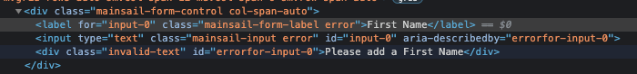
You don't need to wire up your labels with your inputs when using FormControl. This is handled for you under the hood. You can see this by clicking the FormLabel in the stackblitz example above. Notice that the focus gets directed to the proper input (or inspect the elements to see something similar to this screenshot).
Columns and Layout#
<FormControl/> pairs well with AutoGrid. And since AutoGrid is flexible enough to nest as needed. You can position and layout rows and columns in flexible ways that support automatic responsive behaviors with little effort.
The props colSpan is supported natively on the FormControl for use inside AutoGrid. This allows you it to declare its own number of columns that it should stretch across.
Alternatively, you could use parent AutoGrid components to control spanning and column handling.
In the stackblitz example above, we could just as easily take the parent AutoGrid and nest it inside something like this:
<AutoGrid cols={12} className="w-full"> ...</AutoGrid>This would provide a grid that offers 12 columns across the entire width of the page (parent). This, then affords you the ability to start specifying where you want to start the form to start on the horizontal axis with colStart and colEnd props on the parent.
See the Advanced Grid Form demo for more details on this technique.