Building a Component
Using Generators 🧞♂️#
Each component has a set of files associated with it:
<component>.js- where the bulk of the component is built<component>.scss- where the component styles live<component>.stories.js- where the component Storybook code lives<component>.test.js- jest / RTL testsindex.js- main export file for cleaner imports
Thankfully, you don't have to manually create these each time you need to set up a new component.
Mainsail UI utilizes the fantastic Plop JS to make development a little easier by reducing the boilerplate needed and keeping you from starting with nothing.
Generate a new component#
yarn scaffold componenttip
Note: omitting the component argument will result in multiple choice prompts
This will prompt you for the following:
- Name: The name used throughout the project (files, folder, tests etc)
- Description: The description will be used in the code comments which will in-turn, be used to auto-generate Storybook description (unless overridden via story configs)
- Category: The Category is strictly for documentation purposes inside of Storybook

Updating Generators#
Note: If ever there is a need to update the scaffolding and generators, see the following for more information:
Two pertinent areas exist for building out generation/scaffolding:
plopfile.js(where the cli configuration lives)plop-templates/*(text manipulation and generation templating files)
See also the Plop JS Docs
Writing the Component ✍️#
If you ran yarn scaffold component and followed the prompts, you have a fresh <component>.js file waiting for you in the src/components/<component>/ folder.
Feel free to use an existing component like the <Badge /> or the <Button /> as a reference guide if needed.
The generated scaffolding should provide a decent starting point with the following structure:
import React from "react";import PropTypes from "prop-types"; // Declare used props and their typesimport { classify } from "utility/classify"; // A helpful className concatenator
import "./MyComponent.scss"; // The scss required for the component styles
// Declare exported enums props up hereexport const variants = {    ...}
/** * MyComponent Description provided by plop scaffolding prompts (used by Storybook) **/export const MyComponent = ({ className, children, ...props }) => {    return (        <div className={clsx("my-component-class", className)}>{children}</div>    );};
MyComponent.propTypes = {    /** (Optional) click handler */    onClick: PropTypes.func,};
MyComponent.defaultProps = {    // Specify the default values of any props here};
// attach your prop enums to the component directly for convenient use to avoid magic strings in component implementation (see Getting Started)MyComponent.variants = variantsA few things of importance about the component structure:
- The component & description name will be generated by the scaffold command prompts
- Functional react components are expected and required
- Prop-Types are expected and required
- Comments above the prop-types are utilized by Storybook for documenting prop tables
Writing the Stories 📚#
Don't forget to start Storybook if you haven't:
yarn startA Storybook story is:#
- an isolated use-case of a component
- able to provide a means of visual/functional operational testing on a unit and integration level
- just an exported react component (which means, you can use React and javascript to do whatever you want with it)
What deserves a Story?#
- if the component is supposed to behave a certain way, make a story for that behavior
- if you want to write a test for a specific behavior or action, make a story first (writing tests will be easier!)
- if you want to visually test a design aspect, make a story that displays that design (chromatic will visually diff changes off of stories)
Stories have a scaffolded initial structure.
import React from "react";
import { MyComponent } from "./MyComponent";
export default {    title: "MyComponentCategory/MyComponent", // Determines the title and nesting structure for navigation in Storybook    component: MyComponent, // Actual component code    argTypes: {        // Arg types can be configured with more options for the docs and addons sections of Storybook (see Badges.stories.js)        ...CustomConfigThatYouMightUse,    },};
const Template = (args) => <MyComponent {...args} />; // Template component pattern aids in code reuse throughout stories
export const Primary = Template.bind({});Primary.args = {    variant: MyComponent.variants.primary,    text: "Click me",};
export const Secondary = Template.bind({});// Defining args this way aids in code reuse and simplicitySecondary.args = { variant: MyComponent.variants.secondary, // No magic strings here, ENUMS accessed directly from the component text: "Click me",};The default export is the primary story for your component. It will dictate what shows up in the Docs tab/section of your Story.
Any additional named exports will be included as additional stories for your component.
Storybook will utilize their export name to generate naming for documentation. This behavior can be overridden (see below Helpful Story Configuration).
Note: the pattern used above for defining stories. This Template.bind({}) + args pattern reduces the unique code necessary per story.
const Template = (args) => <MyComponent {...args} />;
export const Primary = Template.bind({});Primary.args = { variant: MyComponent.variants.primary, text: "Click me",};Helpful Story Configuration#
There are a lot of nuts and bolts that can be configured per story.
Supply a Custom Story Description
For example, to configure docs tab/page descriptions per story, use the .parameters.docs.description.story property on your story export.
export const Controlled = Checkbox.bind({});
Controlled.args = { text: "A choice", isChecked: true,};Controlled.parameters = { docs: { description: { story: "Can be a controlled component via the isChecked prop", }, },};Rename a Story from its Auto-Generated Name
export const Primary = () => <Button text="Button" />;
Primary.storyName = "Fancier Name";tip
For more information on writing stories see the official site.
Writing the Tests 🧪#
While it can be argued that Tests should come first, when working with Storybook, it makes sense to write stories before tests.
This means you will likely work in the following flow:
- Build a Component
- Write a Story
- Write a test
The reasoning here is because exported Story code can be reused in test code to prevent brittle tests and provide direct access to how the Component should operate (its use-case) coming directly from the story.
Here's an example:
// Checkbox.test.js
import React from "react";import { render, screen } from "@testing-library/react";import userEvent from "@testing-library/user-event";import "@testing-library/jest-dom/extend-expect";
import { Basic, Indeterminate, DefaultChecked, IndeterminateGroup,} from "./Checkbox.stories"; // Imported stories are available for testing
it("renders the proper icon with the indeterminate state", () => { render(<Indeterminate {...Indeterminate.args} />); // Render the Story, not the Component, reuse its Story args!
expect(screen.getByRole("checkbox").indeterminate).toBe(true); expect(screen.getByTestId("indeterminate-svg")).toBeInTheDocument();});
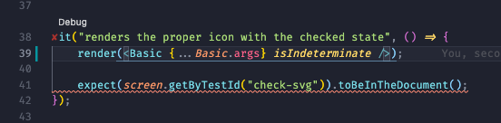
it("renders the proper icon with the checked state", () => { render(<Basic {...Basic.args} isChecked />);
expect(screen.getByRole("checkbox")).toBeChecked(); expect(screen.getByTestId("check-svg")).toBeInTheDocument();});Notice that because we exported the stories with the suggested pattern, we can reuse them within our tests along with their arguments that have been provided to the story!
This results in tests that are:
- 🎉 Shorter
- 🧐 Easier to read
- 🔗 Stay up-to-date with their component/story with less duplication
- 🏖 Focus less on implementation details
Running Tests 🏃♂️#
If you have VS Code and the Jest Plugin (or a similar editor and plugin), you might be able to benefit from inline test runs. Your tests can be running while you write code and provide realtime feedback on the file you're currently working with.
If you like it old school, feel free to run them from the command line:
yarn test